Skip to content
0208 6000 500
Software
For Curtains & Blinds Online Retailers
For Auto Car parts – online retailers
Science Lab Management Software
Orderwise Development Agency
Digital Asset Management Software
E-commerce
Web Design
Paid Marketing
Google Ads – PPC
Facebook Ads Management
Amazon Ads Management
Pinterest Paid Promotion
TikTok Paid Promotion
SEO
About
Faqs
Contact
Web Development
E-commerce Website Development
Magento Development Agency
WooCommerce Development Agency
Shopify Development Agency
Hyva Development Agency
Website Design and Web Development
WordPress Development
Starter websites <£2,500
Wix websites <£1,300
Branding & Graphic Design
Bespoke .Net Software & Solutions Developmnent
Progressive Web Apps (PWA)
Science Lab Management Software
Curtain Ordering Software
3rd Party Software Integration
Orderwise Software Integration
Corporate Web Hosting Services
Online Marketing
SEO Agency
Content Marketing
Core Web Vitals
Local Search Engine Optimisation
Conversion Rate Optimisation
Link Building Agency
Paid Marketing
Amazon PPC Management
TikTok Paid Promotion
Pinterest Paid Promotion
Google Adwords PPC
Bing Ads PPC
Facebook Ads Agency
Display Remarketing
Google Shopping
Email Marketing
Datadial Blog Archive
Articles & Insight
Datadial Blog Archive
Enquire now
Differences between Google Search and LLMs
The Google Analytics 4 Tutorial for Beginners
Best SEO browser extensions that professionals use in 2021
Understanding keyword research, user intent and entities
How SEO and Web Development Work Together to Improve Rankings in 2021
What is Local SEO & How Important it is to Rank in Local Search in 2021
The Best Managed Hosting: Who’s The Best For Your Site? [Updated: 2020]
How We Design Website Experiences
7 Benefits Of Using PPC and SEO In Synergy
The Importance Of Dwell Time For SEO
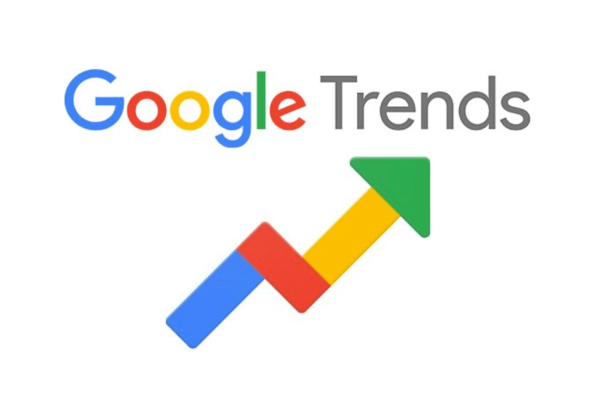
How Can You Use Google Trends For SEO?
The 2020 Keyword Research Guide for SEO
Posts pagination
1
2
…
25
Next