Skip to content
0208 6000 500
Software
For Curtains & Blinds Online Retailers
For Auto Car parts – online retailers
Science Lab Management Software
Orderwise Development Agency
GenetiQ (formerly Intact Software)
Digital Asset Management Software
E-commerce
Web Design
Paid Marketing
Google Ads – PPC
Facebook Ads Management
Amazon Ads Management
Pinterest Paid Promotion
TikTok Paid Promotion
SEO
About
Faqs
Contact
Web Development
E-commerce Website Development
Magento Development Agency
WooCommerce Development Agency
Shopify Development Agency
Hyva Development Agency
Website Design and Web Development
WordPress Development
Starter websites <£2,500
Wix websites <£1,300
Branding & Graphic Design
Bespoke .Net Software & Solutions Developmnent
Progressive Web Apps (PWA)
Science Lab Management Software
Curtain Ordering Software
3rd Party Software Integration
Orderwise Software Integration
Corporate Web Hosting Services
Online Marketing
SEO Agency
Content Marketing
Core Web Vitals
Local Search Engine Optimisation
Conversion Rate Optimisation
Link Building Agency
Paid Marketing
Amazon PPC Management
TikTok Paid Promotion
Pinterest Paid Promotion
Google Adwords PPC
Bing Ads PPC
Facebook Ads Agency
Display Remarketing
Google Shopping
Email Marketing
Datadial Blog Archive
Articles & Insight
Category: Design
Back to article list
Enquire now
How We Design Website Experiences
Parallax Design and SEO – Compatibility Problems
The 3 Options for Making Your Website Mobile and a 4th.
Hierarchy – What do you want people to see? Where do you want them to go?
Time delay video of the Taylor Herring website build
Best & Worst of FOWD Day 2
Best & Worst of FOWD London Day 1
Creating the new Datadial website
Inspiration: Typography
The differences between Helvetica and Arial
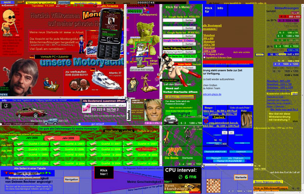
Website FAIL – 30 Web Designs That Will Hurt Your Eyes
Rapid wireframing with collage
Next