“Good visual hierarchy isn’t about wild and crazy graphics or the newest photoshop filters, it’s about organising information in a way that’s usable, accessible, and logical to the everyday site visitor.”
Brandon Jones on Sep 28th 2011 www.webdesign.tutsplus.com
The basis of design is communication – relaying a message or inducing a reaction, calls or click. With basic media advertising designers were fixated with the 3-second rule, whereby the advert has 3 seconds to get its message across above other adverts on the page.
The 3-second rule dictates that media adverts should incorporate bold, simple and clear messages and images. When implemented, this often led to aggressive layouts that were not pushing the envelope of design and could actually be classed as de-evolution of design. The finished result was an advert that was not necessarily aesthetically pleasing, but does bring into focus the importance of design hierarchy.
What does the user need to see in order?
- Sector / Product / Service – Industrial and Commercial Flooring (heading and image).
- Key information usually displayed as bullet points for ease of reading.
- Area(s) the company covers or is based in (Loughborough).
- Local Contact Number (01509 000000).
What do you want them to do?
- Recognise the sector, service or product being supplied by the company.
- Gain reassurance that the company is local and supplies what they are looking for.
- Call the telephone number
This hierarchy principle continues today and forms the basis of all media advertising.
Similar time frames have been mentioned when viewing websites but you very rarely get multiple websites shown side-by-side, advertising the same sector.
Website design has increasingly required multiple messages or multiple design prompts which navigate people around a site to a desired location or outcome, meaning hierarchy has become an even more vital part of design.
Once a website is opened it competes against itself, with its own messages and design prompts. A site will succeed or fail according to how well the design functions for the user. This is also dependent on what the user requires from the site. Getting relevant traffic to your site overrides all visual stimuli, but that’s a whole new subject that I won’t get into now.
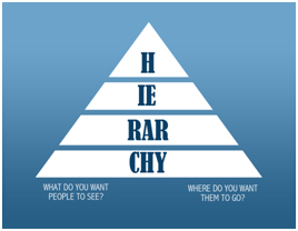
Good hierarchy in web design should dictate what you want the user to read, in what order and where you want them to go. Destination or conclusion depends on the requirements and reasons of the user and most websites will contain information for multiple products or services including required action for each, such as call, click or renewed confidence with the company for example.
“The human brain has innate organizing tendencies that “structure individual elements, shapes or forms into a coherent, organized whole.”
Jackson, Ian. “Gestalt—A Learning Theory for Graphic Design Education.” International Journal of Art and Design Education. Volume 27. Issue 1 (2008): 63-69. Digital.
The human brain does not view individual items on their own merit and will instead organise them against the items around them. Items are instantly judged and ordered and size, shapes and colours inform us that the items may have more dominance than others. Understanding these principles allows us to form hierarchy within designs and use this to control the users pathway through the design.
Brad Jones explains 5 steps to analyse hierarchy in his post on www.webdesign.tutsplus.com:
Take a website you want to analyse and follow these 5 steps:
- List the key information points that visitors are likely seeking.
- Assign values (1-10) according to their importance to the average visitor.
- Now, look at the actual design again.
- Assign values (1-10) according to the actual visual importance as you see it in the live design.
- Consider: Does the expected importance match up with the actual designed importance?
In most cases, the answer will include shades of “no”. There are lots of reasons for this – client demands, inexperienced designers, design-by-committee – or a hundred other reasons that you’ve probably read.
Brandon Jones on Sep 28th 2011www.webdesign.tutsplus.com
The designer’s role is to take the required information and break it down into visually relevant and easily digestible portions. This has to be done while taking into account the goals and messages of the design. It is not enough to just layout the information, it has to work.
In general, service or product sites tend to work around USPs (unique selling points) and CTAs (call to actions). 2 or 3 USPs encourage the user to have confidence in the design and the 1 or 2 CTAs encourage goal conversions. These have to be displayed around a main message USP to allow the user to be reassured that the site they are using holds the information or product they are looking for.
Unfortunately, design input rarely comes from one direction. In an ideal world sites would be carved from pure creativity while using god-like functionality and subconscious triggers all based around the hierarchy mentioned earlier. In reality, the client will always want the logo bigger and will always ask “can you just make these 12 things all stand out more?”
The struggle continues…
“This post was written by James O’Flaherty on behalf of Adtrak”


