You have built a website and sell product from it. You have entered the wonderful world of e-commerce. The question is, how well is your site performing? How are your e-commerce conversion rates?
There are a number of relatively straightforward ways to improve the conversion rates of your e-Commerce site. Here are forty ideas that you can use to ensure that potential customers find visiting your site a pleasant experience; a place where they find it worth their while spending their hard-earned money.
1. Define your engagement strategy
It is vitally important that you determine exactly how you intend to engage with your potential customers. You want to ensure that these customers perceive that you are giving them value
2. Use social media as a sales channel
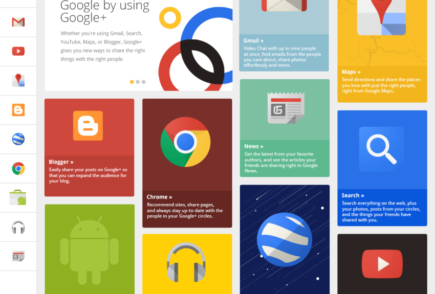
There is a considerable amount of marketing done using social media – Facebook, Twitter, Google +, Pinterest etc. Firms use these channels because they work
3. Have a clear, navigable product page
Make it as easy as possible for people to find their way around your site and make a purchase. People are not going to be bothered if it is hard to work their way around your site
4. Make product features prominent
Customers really want to know about your product. Therefore product features should have the highest prominence on your page.
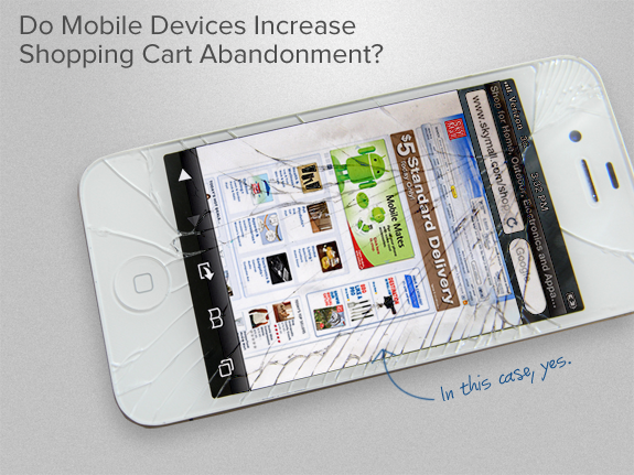
5. Don’t forget about mobile
In mid-2014 mobile internet usage exceeded computer internet usage. It is absolutely vital that your web presence is usable by people on mobile sites. It is a very good idea that your site is fully responsive, and (unless you have a separate mobile-specific site) your site scales down appropriately for mobile usage
6. Think carefully about your online copy – use key words and SEO
Always write with SEO (search engine optimisation) in mind, to ensure that the potential customers have a good chance of finding you in a Google or Bing search.
7. Make certain that your content is original
Your products may be the same as those on many other websites, but you need to ensure that your product descriptions are not a direct copy of those elsewhere. You need to reword each description to ensure that it is different to your competitors’ descriptions. The search engines look for, and penalise duplicate content.
8. Use photos
The internet is a visual medium. Web surfers spend much of their time looking at pictures and graphics. Potential customers want to know what a product looks like, showing the product in use if relevant.
9. Use lots of variety in your product photos
As customers cannot physically feel your product, they expect to be able to have a good view of it. This depends to some extent on your product, but in many cases potential clients are far more likely to buy your product if there are photos of it from different angles, giving an all-round view. A number of the better sites even have 360 degree viewers.
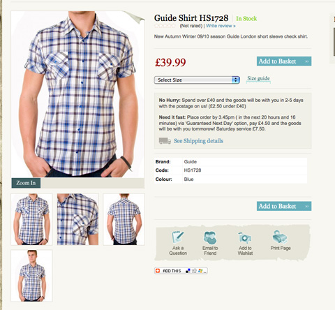
10. Provide tools to zoom in on your product photos
Another way to utilise photos of your products is to give potential customers the ability to zoom in and look at the fine details of your product.
11. Use videos if relevant
Many people browsing your site will be converted when they see a video of your product in action, particularly if it makes it clear that your product is useful and easy to operate.
12. Use a well-designed drop-down menu
If you have well-designed drop-down menus as navigation on your site it makes it easy for potential customers to find their way around your site. Avoid having these menus go more than 2 levels, though, because it can get confusing after that, and you lose the responsiveness for mobile browsers
13. Have a good site search function on your website
Site search makes it easier for customers to find what they want. Surveys show that up to 30% of people visiting a site use the site search function.
14. Offer complementary products on your product pages
Customers thinking of buying a particular product may choose to buy these complementary products, e.g. batteries beside electrical products, or on book sites show other books written by a particular author.
15. Make certain that you appear trustworthy.
There are too many fly-by-night firms on the internet. Customers want some evidence why they should trust you. Include a genuine telephone number. Include genuine reviews. Offer guarantees. If you use a certification brand, like McAfee Secured, make sure their logo is displayed in a prominent position.
16. Display a free phone number
Customers expect to be able to talk to you. Reputable firms use free phone numbers, so it is essential to your firm’s reputation that you do too.
17. Make chat available as a means of communication
It is all very well to offer a Freephone number and a Help or FAQ section on your site, but the easiest way to get interaction with a potential customer (well a reasonably computer-literate one at least), is to have a chat facility. It’s as close as you can get to there being a salesman in person to answer the customer’s questions
18. Consider offering video-chat on your site
This is even better than normal chat – your customer can see and interact with a real person, who could even demonstrate some features of the product
19. Make certain that your prices are clear and obvious
You don’t want disgruntled customers leaving, either because they can’t find the prices amongst all the guff on your page, or because they get to check-out only to find hidden costs added on. Prices need to be totally clear to your customers at a glance
20. Price competitively to your opposition
On-line customers have far more ability to do price comparison than brick and mortar customers. They can, and will, do price comparisons. You do need to be price competitive.
21. Look at offering Price Match
Being prepared to match your competitors’ prices will build up trust in you by potential customers. You may not earn as much from a particular sale, but hopefully you will make up for it with future sales. This is probably one to test over a period of time, because it will not be suitable for everyone.
22. Give limited time discounts
A classic marketing trick. Make your customers think they have to rush their decision and make a choice now, before they lose a discount.
23. Make payment easy for customers
The more payment options you have available the more potential customers will shop at your site.
24. Make a point out of offering free shipping
This is, of course, only viable if your margins can cover the free shipping. If so, then it will often be the deciding factor when a potential customer is trying to decide between you and a competitor –albeit the customer is still paying in a more indirect way
25. Offer quick delivery times
Customers like speedy delivery of products ASAP, and will often be willing to pay a premium for urgent delivery.
26. Show your daily cut-off delivery time on your site
Indeed it is very useful if you show a timer, indicating how long your customers have left to be able to get goods dispatched for delivery today. This probably depends on where you sell stock to – if most of your sales are overseas, it probably makes little difference whether the stock is dispatched today or tomorrow
27. Show your returns policy
It removes potential customers’ doubts if they can clearly see the ease with which they can return goods. If you offer Free Exchange, or a Money Back Guarantee, display it prominently.
28. Have low stock indicators on your site
It helps your customers if they know whether you have a particular stock item on hand (and if you don’t, how long will it take you to get replacement stock?
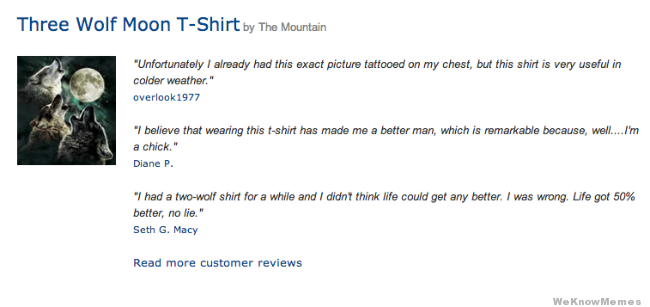
29. Use product reviews by customers
Customers like to see how others have found using the products they are considering buying. Include product reviews to assist potential buyers.
30. Show your seller ratings if you are operating in a community marketplace
If you are just one seller amongst many, for example a store in the Amazon Marketplace, displaying your seller rating (and other information about yourself) will build up trust.
31. Have clear Call to Action buttons
Make certain your call to action buttons are clear and obvious. Make certain that you test these out before they go live.
32. Use coloured buttons to direct customers through your check-out process
If you want to direct potential customers to take a certain path, highlight the button you want them to push a clear and obvious colour. Conversely, make any buttons that reverse you back through the check-out process, grey.
33. Make certain there are no programming errors visible to your customers
Nothing looks more amateurish to website browsers that when an error message comes up when they try and order from your site. Only the most determined will continue forwards – anyone else will leave your site almost instantly.
34. Use test shoppers before your shop goes live.
You do not want real customers to find flaws in your system. It is far better if you hire a few people to act as test shoppers first, and take good notice of any flaws they find navigating and using your website.
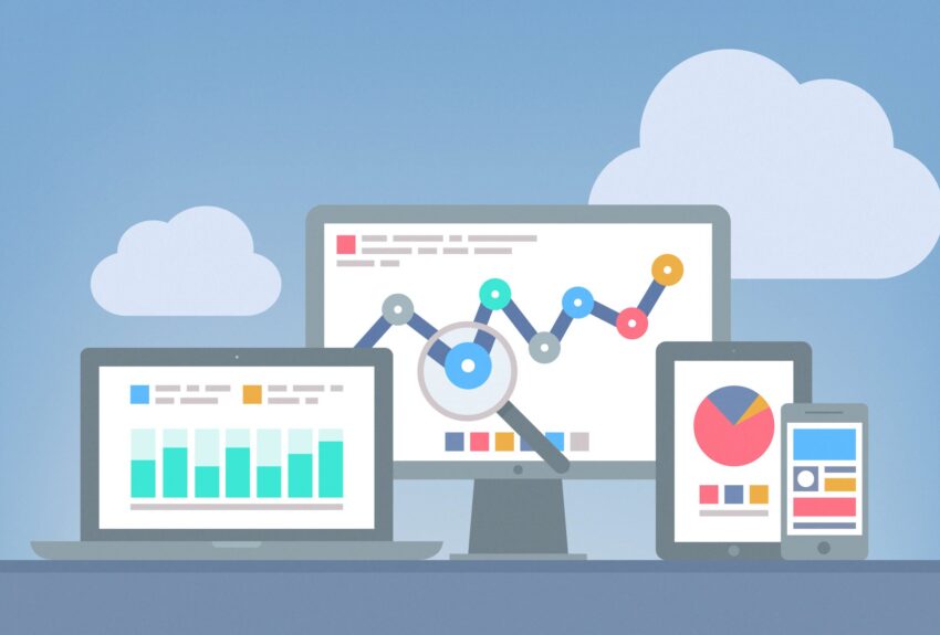
35. Use relevant tools to optimise your site
There are some tools specifically aimed at optimizing your conversions, e.g. Optimizely, Visual Website Optimizer, Qualaroo, The Cart Closer etc. Try them out and keep using the ones that suit you best
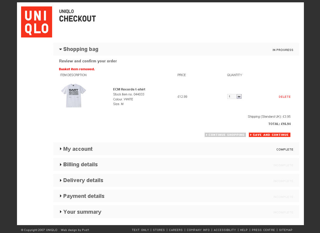
36. Ensure your check-out fits on a single page
Multi-page check-outs send potential customers away, and a number pull out of the transaction part-way through the process. Make certain that the plugin or whatever checkout method you are using enables the check-out process to occur on a single page
37. Avoid compulsory registration at the checkout
Customers are often turned away because of the rigmarole of going through a compulsory registration process. It is far better to have an optional registration process once the order is processed
38. Only ask for essential information from customers
Potential customers get put off by having to fill in too much information. The simple rule is that if an item of information is not absolutely necessary, do not ask for it. Have a clean, stream-lined check-out page
39. Use automatic address recognition at your check-out
There are various apps / plug-ins that simplify the process for a customer entering their address. A customer is more likely to go through the purchase process if they do not have to make too much effort to get through the check-out
40. Use one-click process to speed up the check-out
Add an Amazon or PayPal button to your checkout to speed up processing of orders for your customers.
I suggest that you take a close look at your website and see how it rates in relation to these guidelines. If need be, make some changes. They will almost certainly be worth your while and the outcome should be increased sales.